
-
Hierarchical Formatting
Use hierarchical formatting to clarify the relationships among ideas. -
Outline View
Be sure all of the text content from all slides appears in the Outline view with the correct hierarchy of slide titles, topics, and subtopics. -
Slide Layouts
Use one of the slide layouts provided by PowerPoint. -
Text Boxes
Do not use text boxes. -
Images
Provide a text equivalent for all images. -
Links
Create link text that contains the link’s destination. -
Unique Titles
Give each slide a unique title. -
Color
Never use color alone to communicate. -
Contrast
Use good contrast. -
Text Size
Use sufficient text size. -
Slide Transitions
Avoid automatic slide transitions. -
Captioning
Ensure that all videos embedded in your slides or linked to from your slides are captioned, and provide transcripts for all audio files. -
Additional Resources on Creating Accessible PowerPoint Presentations
Hierarchical Formatting
Tip: Use hierarchical formatting to clarify the relationship among ideas.
Creating Hierarchical Formatting
Rationale for Creating Hierarchical Formatting
Creating Hierarchical Formatting
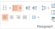
Most PowerPoint layouts, by default, provide automatic bulleting which facilitates creating hierarchical relationships among ideas. Use the bulleted and numbering list options in the Paragraph group on the Home ribbon to adjust the format of your lists.
Rationale for Creating Hierarchical Formatting
Hierarchical formatting makes it easier for everyone to discern main topics from subtopics, etc.
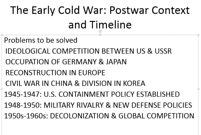
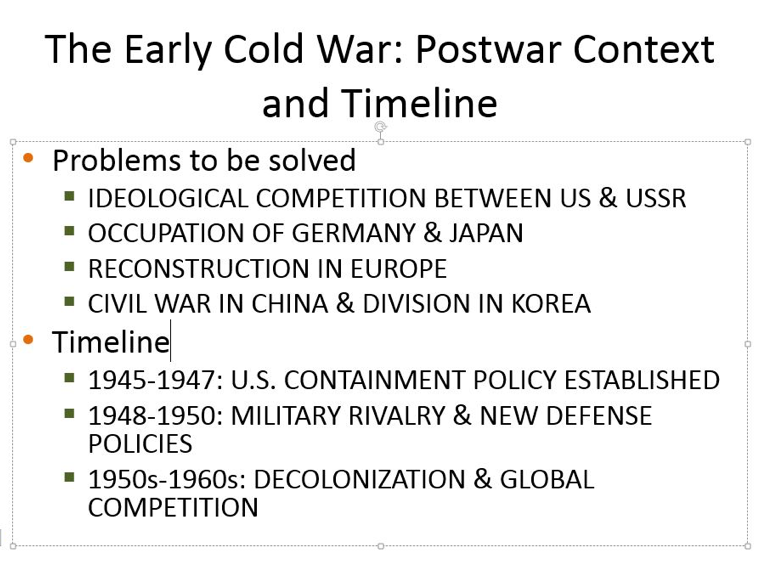
Below are images of two slides. The first has no hierarchical formatting; the second uses bullets to express relationships among the topics.
Outline View
Tip: Be sure all of the text content from all the slides appears in the Outline view with the correct hierarchy of slide titles, topics, and subtopics.
View a Presentation in Outline View
Rationale for Viewing Presentations in Outline View
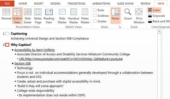
View a Presentation in Outline View.
Open the View menu, and choose Outline view from the Presentation Views group.
Rationale for Viewing Presentations in Outline View
It is important to ensure that all text gets included in the Outline View for the following reasons.
-
Some students with visual disabilities prefer reading the text in the outline view.
-
The outline view provides everyone an overview of the text content.
-
When a student requires the PowerPoint content to be provided in another format (e.g., Word), the most efficient conversion starts with copying the text from the Outline view.
-
Reviewing the Outline panel can help ensure the content on the slides is logically sequenced, slide titles are unique and meaningful, and reading order is appropriate.
Slide Layouts
Tip: Use one of the slide layouts provided by PowerPoint.
Using Slide Layouts to Structure Slides
Rationale for Using Slide Layouts to Structure Slides
Using Slide Layouts to Structure Slides
Click the Layout button on the Home ribbon, and then choose one of the Layout slide options.
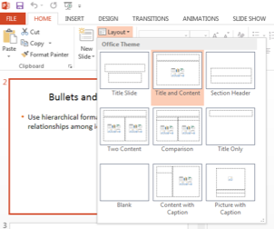
Rationale for Using PowerPoints Slide Layouts
Using one of the layouts provided by PowerPoint results in well-structured slides with hierarchical headings and subtopics. People using software to hear the slides will hear the content in the correct reading order. Additionally, all the text will be available in the Outline view.
Special Note
Resizing the boxes provided through the Layout options does not diminish the advantages of using those layout options versus text boxes.
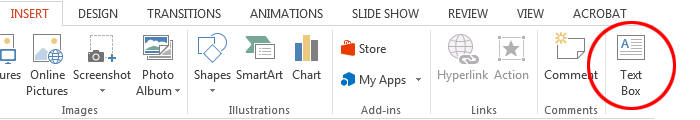
Text Boxes
Tip: Do not use text boxes.
Rationale for Not Using Text Boxes
Rationale for Not Using Text Boxes
Text inserted into boxes created by choosing Text Box from the Insert menu, does not appear in the Outline and is likely to disturb the reading order of slides for people who are listening to the slides with screen reading or text-to-speech software.
Images
Tip: Provide a text equivalent (i.e. alt text) for all images.
Process for Providing Images with Text Equivalents.
Rationale for Text Equivalents and Examples
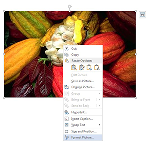
Process for Providing Images with Text Equivalents
Alt Text
The following directions cover adding alt text in PowerPoint 2013.
Special Note
Adding alt text varies a bit with different versions of PowerPoint. Do not hesitate to contact any one of our SMC accessibility people resources (LINK to Resources) if you have questions.
-
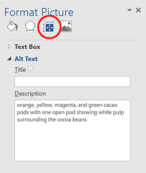
Right click the image, and choose Format Picture from the context menu.
-
From the Format Picture options, choose the Layout and Properties button.
-
Enter the alt text in the Description edit box.
Longer Descriptions
For complex images conveying instructional content (e.g., charts, graphs, paintings for art history courses), alt text does not suffice. In these cases, add alt text to the image and provide a longer description within the PowerPoint slide or an adjacent slide. The text of the longer description should reflect what professors want students to know.
Special Note
Occasionally, professors cannot provide longer descriptions because explaining the image is the assignment. Under these circumstances, appropriate accommodations are developed collaboratively among students, professors, DSPS faculty/staff and others, as appropriate.
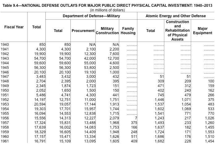
Below is an image of a chart with examples of alt text as well as a longer description.
Alt text
-
National Defense Outlays for Major Public Direct Physical Capital Investment: 1940-2013
Longer description:
-
This chart on United States military spending shows a drop immediately after World War II with higher spending restarting during the Korean War. It shows spending on nuclear-related items begins in 1947. An additional related expense beginning in 1956 was housing for military families.
Special Note
If a blind student needed access to all the specific numbers in the chart below, an additional accommodation would be necessary (e.g., re-creating the chart in an Excel spreadsheet).
Purely Decorative Images with No Communicative Purpose
Ideally, each image we incorporate into our web pages will have a meaning we want to communicate to our students, colleagues, etc. Should you for some reason, add an image with absolutely no communicative value, omit the alt text.
Rationale for Image Descriptions and Examples
People who are severely visually impaired cannot see images; therefore, each image needs a text equivalent the visually impaired individual can hear using screen reading software and/or feel using a refreshable Braille display. All images need alternative (alt) text. Thoughtful alt text provides a succinct (no more than about 100 characters) description of the image’s function, and reflects the context in which the image has been placed. Complex images requiring more than 100 characters to communicate their importance also need longer descriptions, ideally provided within the PowerPoint slide or an adjacent slide. Fortunately, any alt text you provide for PowerPoint images will also be available if you save your PowerPoint file as a PDF file.
Examples of Alt Text and Their Context

Context: Personal web page
Sample Alt Text: My four month old Schnauzer puppy, Max

Context: Web page for popular culture course unit discussing modifications of classic art
Sample Alt Text: cartoon of screaming duck, a parody of the Munch painting
Links
Tip: Create link text that contains the link’s destination.
Rationale
Accessible and Inaccessible Examples
Additional Resources on Links
Rationale
Creating link text that makes sense out of context is important because screen reader users can listen to a list of all links extracted from a PowerPoint slide and navigate within that list by first letter. Listening to a list with items like “Click here” or “More” is not helpful.
Accessible and Inaccessible Examples
Unclear Link Text
Click here to go to the Getty Museum.
Click here to go to the Getty Museum.
http://www.youtube.com/watch?v=0sJ1R58pQTs
Usable Link Text
Click here to go to the Getty Museum.
Additional Resources on Link Text
Link Text from Penn State Accessibility
Unique Titles
Tip: Give each slide a unique title.
Rationale for Giving Each Slide a Unique Title
Rationale for Giving Each Slide a Unique Title
Giving each slide a unique name eliminates any confusion about slide order. If you have more than one slide on the same topic, number the slides, e.g., Effects of Global Warming 1, Effects of Global Warming 2.
Color
Tip: Never use color alone to communicate.
Rationale for Not Using Color Alone to Communicate.
Use of Color Examples
Color Blindness Simulators
Rationale for Not Using Color Alone to Communicate Information
People who are color blind or severely visually impaired cannot discriminate on the basis of color.
Use of Color Examples
Inaccessible Use of Color
The new vocabulary words are listed below. The words in red will definitely be on
the test.
1. diffident
2. homeostatis
3. diabesis
4. prolix
5. sagacious
All homework is due before the exam.
Accessible Use of Color
The new vocabulary words are listed below. “Diffident” and “prolix” will definitely be on the test.
1. diffident
2. homeostatis
3. diabesis
4. prolix
5. sagacious
All homework is due before the exam. In this example. bold and underline are used in addition to color to make the word "before" stand out.)
Color Blindness Simulators
Color Blindness Vision Simulator
Contrast
Tip: Use good contrast.
Rationale
Examples
Color Contrast Standard
Color Contrast Analyzer Tools
Additional Color Contrast Resources
Rationale
Good contrast is mission critical for many people who are visually impaired and simply good design for everyone.
Examples
Good Contrast
Questionable Contrast
Poor Contrast
Color Contrast Standard
SMC must comply with the web accessibility design standards (Link this to the Standards section within the web section) in the Web Content Accessibility Guidelines 2.0, Conformance Level AA. These standards require a contrast ratio between foreground text and background of 4.5:1 for normal text and 3:1 for large text (14 point and bold or larger, or 18 point or larger).
In general, if you are questioning whether contrast is sufficient, assume it is not. To confirm whether a contrast ratio complies with our standards, use a color contrast analyzer tool.
Color Contrast Analyzer Tools
-
Vision Australia Web Accessibility Toolbar
This excellent color contrast tool is incorporated into the Vision Australia Web accessibility Toolbar and is also available separately. It is only compatible with Windows, not the Mac OS.
Additional Color Contrast Resources
Color and Contrast on Web Pages
Text Size
Tip: Use sufficient text size.
Rationale for Using Sufficient Text Size
Rationale for Using Sufficient Text Size
Small fonts make viewing presentations difficult for everyone especially for most people who are partially sighted. David Paradis of Think Outside the Slide provides a chart showing the “maximum distance from the screen that an audience member should be seated in order to be able to easily read a given text size.”
Automatic Slide Transitions
Tip: Avoid automatic slide transitions.
Rational for Not Using Automatic Slide Transitions
Rationale for Not Using Automatic Slide Transitions
Automatic slide transitions preclude each person’s opportunity to spend as much time with a slide as needed.
Captioning
Tip: Ensure that all videos embedded in your slides or linked to from your slides are captioned, and provide transcripts for all audio files.
Rationale for Captioning
Support for Captioning
Rationale for Captioning
All multimedia must be captioned, and all audio files need to be accompanied by a transcript to accommodate people who are deaf/hard-of-hearing.
-
If you have a deaf/hard-of-hearing student in your class and your chosen multimedia is not captioned, this multimedia cannot be shown or assigned.
-
If you have a deaf/hard-of-hearing student in your class and your online multimedia is not captioned, your links to that multimedia need to be inactive until the captioning is completed.
-
Here is the only exception: No students in your class need captioning as an accommodation and the multimedia will be used for the current class ONLY (e.g., YouTube video on a current event), not in a subsequent semester.
Support for Captioning
Christine Miller, Distance Education Multimedia Specialist, x3765
Contact Christine for all questions related to captioning with CANVAS.
Elena Throckmorton, Disabled Student Services, x4267
Contact Elena for all captioning questions not related to CANVAS.