Making Word documents accessible is like a gift that keeps on giving because accessible Word documents can be transformed into accessible documents in other formats (e.g., PDF files).
-
Heading Styles: Structure your documents by applying Heading Styles.
-
Text: Use accessible text formats and spacing.
-
Images: Provide text equivalents for all images.
-
Links: Create hyperlink text that makes sense out of context.
-
Columns: Do not create columns using the tab key.
-
Color: Do not communicate information by color alone.
-
Contrast: Use good contrast
-
Lists: Use the numbered list and/or bulleted list features to emphasize points or communicate sequence.
-
Tables: Use only simple tables, identifying the top row as table headers that repeat on every page. Provide each table a title and description.
-
Accessibility Checker: Use Word’s Accessibility Checker, available in Word for Windows 2010+)
-
Save Word Document as Accessible PDF: How to save your accessible Word document to make sure it is accessible in a PDF format.
Heading Styles
Tip: Structure your document by applying heading styles.
Process
Rationale
Process for Creating Headings in Word
-
Select the text to which you want to assign a heading.
-
Choose the appropriate heading level from the Styles Group on the Home Ribbon.
Special Note
Word assigns a certain look (color, size, alignment, etc.) to each heading level. If you want to modify that default look, right click the heading level in the Styles Group, and choose Modify… from the context menu. Make your changes in the Properties dialog box then click OK. All text that has already been assigned that heading level will transform itself to reflect your new settings.
For support in learning more about working with headings in Word, contact Waleed Nasr, Senior Resource Specialist, x4398 in the Faculty/Staff Lab.
Rationale
Providing clear section titles using heading styles facilitates good organization and ultimately comprehension. It also lets you create an TOC based on the headings. Additionally, it makes it possible for blind people listening to a document to get the document structure.
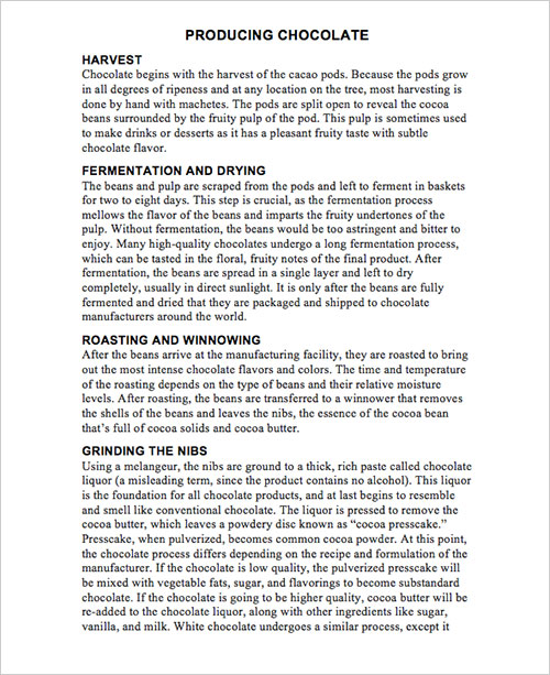
When sighted people look at the Word document pictured below, they immediately know the title is Producing Chocolate, the first major section is Harvest, the second major section is Fermentation and Drying, etc.
How can this organizational structure be communicated to someone blind who is listening to the document? This is accomplished by structuring the document with consistent headings (H1, H2, etc.) created using the Styles feature accessible through the Home Ribbon. (Refer to how to section)
Headings are titles given to sections of a document or web page. The title of a document is usually considered the top level heading otherwise known as heading 1. The major document section titles are known as heading level 2. For example the document about how chocolate is produced is called “Producing Chocolate.” The title “Producing Chocolate” is a heading level 1. The titles of the major sections (Harvesting, Fermentation, Drying, etc.) are classified as heading level 2.
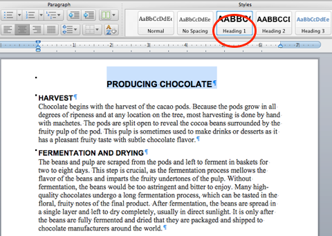
Below is an image of a Word doc with both the title and the Heading 1 button in the Styles Group selected
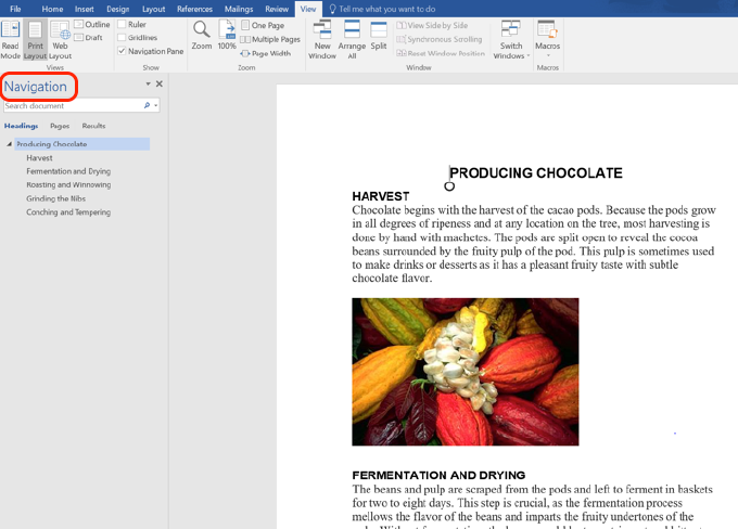
Below is an image of a Word 2016 for Windows document with the Navigation Pane open so you can see the outline reflecting the heading structure.
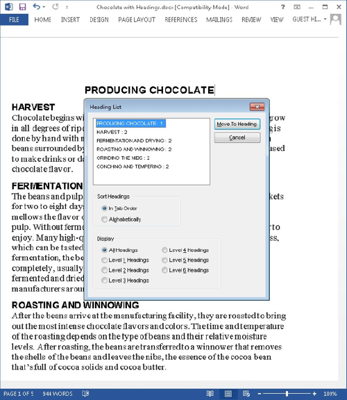
Well-structured headings enable visually impaired people who are listening to Word with screen reading software to hear an outline of the document. Below is an image of what screen readers read aloud when prompted to provide the heading structure of the same document, Producing Chocolate. And this allows screen reader users to navigate efficiently to their section of choice.
Text
Use accessible text format. Here are some ideas to consider:
-
Add an underline to color-coded hyperlink text. That can help colorblind people know the text is linked even if they can’t see the color.
-
Add shapes if color is used to indicate status. For example, add a checkmark symbol if green is used to indicate “pass” and an uppercase X
 if red indicates “fail”.
Note: These resources provide other suggestions: usability.gov.
Text Spacing
Increase or decrease white space between sentences and paragraphs.
-
Select your text.
-
Select the Home tab.
-
In the Paragraph group, in the lower-right corner of the group, select the More button.
The Paragraph dialog box opens, showing the Indents and Spacing tab. -
Under Spacing, select the spacing options you want.
Images
Tip
Provide alternative text for all images, i.e. concise description of the image’s content/functionality in the context of your Word document. Provide longer descriptions for more complex images.
Process
Rationale
Examples of Alt Text
Additional Resources
Winston Churchill giving iron man speech in 1940
Process for Providing Images with Text Equivalents
Add Alt Text to Images
The following directions cover adding alt text in Word 2013.
Special Note
Adding alt text varies a bit with different versions of Word. Do not hesitate to contact any one of our SMC accessibility people resources (LINK to Resources) if you have questions. On Macs, instead of right-clicking the image, hold down the Control keyboard button and click on it to reveal a contextual menu.
-
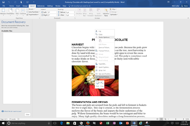
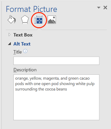
Right-click the image, and choose Format Picture from the contextual menu.
-
From the Format Picture options, choose the Layout and Properties button.
-
Add in the alt text in the description edit box.
Longer Descriptions
For complex images conveying instructional content (e.g., charts, graphs, painting for an art history course) alt text does not suffice. In these cases, add alt text to the image and provide a longer description within the Word document. The text of the longer description should reflect what professors want students to know.
Special Note
Occasionally, professors cannot provide longer descriptions because explaining the image’s importance is the assignment. Under these circumstances, appropriate accommodations are developed collaboratively among students, professors, DSPS faculty/staff and others, as appropriate.
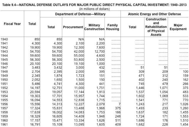
Below is an image of a chart with examples of alt text as well as a longer description.
Alt text
-
National Defense Outlays for Major Public Direct Physical Capital Investment: 1940-2013
Longer description:
-
This chart on United States military spending shows a drop immediately after World War II with higher spending restarting during the Korean War. It shows spending on nuclear-related items begins in 1947. An additional related expense beginning in 1956 was housing for military families.
Special Note
If a blind student needed access to all the specific numbers in the chart below, an additional accommodation would be necessary, e.g., re-creating the chart in an Excel spreadsheet.
Add Alt Text to SmartArt Graphics
- Right-click a SmartArt graphic.
- Select Format Object > Shape Options > Layout & Properties.
- Select Alt Text.
- Type a description and a title.
TIP: Include the most important information in the first line, and be as concise as possible.
Add Alt Text to Shapes
Add alt text to shapes, including shapes within a SmartArt graphic.
-
Right-click a shape, and then select Format Shape.
-
In the right pane, select Layout & Properties, and then select Alt Text.
-
Type a description and a title.
TIP: Include the most important information in the first line, and be as concise as possible.
Add Alt Text to Charts
-
Right-click a chart.
-
Select Format Chart Area > Chart Options > Layout & Properties.
-
Select Alt Text.
-
Type a description and a title.
TIP: Include the most important information in the first line, and be as concise as possible.
Add Alt Text to Tables
-
Right-click a table.
-
Select Table Properties.
-
Select the Alt Text tab.
-
Type a description and a title.
TIP: Include the most important information in the first line, and be as concise as possible.
Purely Decorative Images with No Communicative Purpose
Ideally, each image we incorporate into our web pages will have a meaning we want to communicate to our students, colleagues, etc. For whatever reason, should you add an image with absolutely no communicative value, omit the alt text.
Rationale for Image Descriptions
People who are severely visually impaired cannot see images; therefore, each image needs a text equivalent the visually impaired individual can hear using screen reading software or feel using a refreshable Braille display. All images need alternative (alt) text. Thoughtful alt text provides a pithy (no more than about 100 characters) description of the image’s function, its vital essence, and reflects the context in which the image has been placed. Complex images requiring more than 100 characters to communicate their importance also need longer descriptions, ideally provided within the Word document.
Examples of Alt Text and Their Context
Personal web page
My four-month-old Schnauzer puppy, Max
Scream
Web page for popular culture course unit discussing modifications of classic paintings
Additional Resources for Image Descriptions
Art Beyond Sight, Guidelines for Verbal Descriptions
Hyperlinks
Tip: Create hyperlink text that makes sense out of context.
Process
Rationale
Accessible and Inaccessible Examples
Process
-
Copy the web address to which you want to link.
-
Select your link text from within the context of your document.
-
Open the Insert menu, and choose Hyperlink.
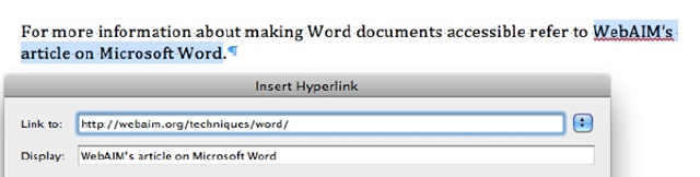
-
Observe that the Display: edit box, has your link text.
-
Press Control V (Command V for Mac) to paste the web address into the Link to: edit box.
Add ScreenTips
Select the ScreenTip button and, in the ScreenTip text box, type a ScreenTip.
TIP: If the title on the hyperlink's destination page gives an accurate summary of what’s on the page, use it for the hyperlink text. For example, this hyperlink text matches the title on the destination page: Templates and Themes for Office Online (Links to an external site.).
Rationale
Creating link text that makes sense out of context is important because screen reader users can listen to a list of all links extracted from a web page and navigate within that list by first letter. Listening to a list with items like “Click here” or “More” is not helpful.
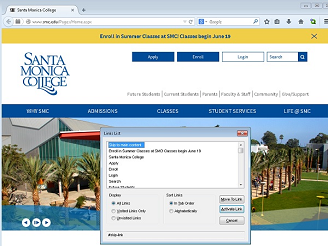
Below is an image of a screen reader’s link list. A blind user listening to a web page and navigate through the list using up and down arrow keys and/or by typing the first letter of the link needed.
Accessible and Inaccessible Examples
Unclear Link Text
Click here to go to the Getty Museum.
Click here to go to the Getty Museum.
Usable Link Text
Click here to go to the Getty Museum.
Additional Resources on Link Text
Link Text from Penn State Accessibility
Columns
Tip: Never create columns using the tab key. Instead use a simple table or the column feature.
Rationale for Not Creating Columns with the Tab Key
Rationale for Not Creating Columns with the Tab Key
Columns created using a tab key, do not maintain their integrity when you change text size.
Below is an example of columns created using the tab key. The text is 12 point Times New Roman.
Below are the catawampus columns resulting from increasing the text size in the tab-created columns to 20 points.
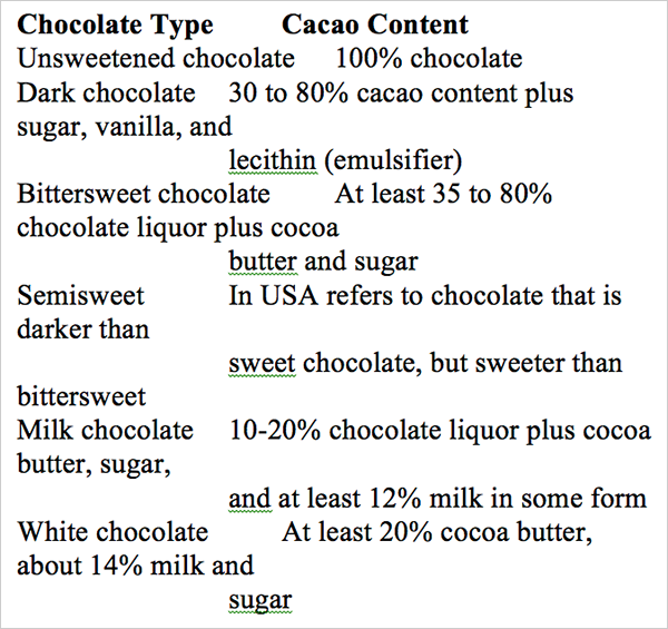
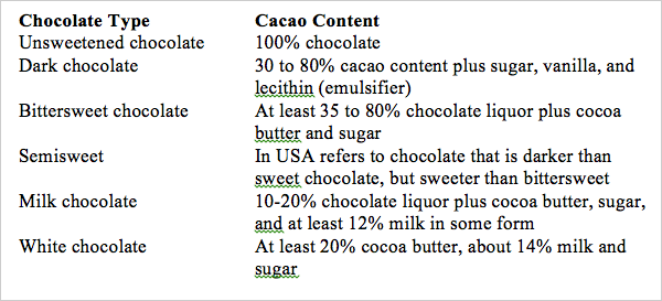
Below are columns created using a simple table, the first with 12 point text, the second with 20 point text. Despite the increase in text size, the integrity of the columns is preserved.
|
Chocolate Type |
Cacao Content |
|---|---|
|
Unsweetened chocolate |
100% chocolate |
|
Dark chocolate |
30 to 80% cacao content plus sugar, vanilla, and lecithin (emulsifier) |
|
Bittersweet chocolate |
At least 35 to 80% chocolate liquor plus cocoa butter and sugar |
|
Semisweet |
In USA refers to chocolate that is darker than sweet chocolate, but sweeter than bittersweet |
|
Milk chocolate |
10-20% chocolate liquor plus cocoa butter, sugar, and at least 12% milk in some form |
|
White chocolate |
At least 20% cocoa butter, about 14% milk and sugar |
|
Chocolate Type |
Cacao Content |
|---|---|
|
Unsweetened chocolate |
100% chocolate |
|
Dark chocolate |
30 to 80% cacao content plus sugar, vanilla, and lecithin (emulsifier) |
|
Bittersweet chocolate |
At least 35 to 80% chocolate liquor plus cocoa butter and sugar |
|
Semisweet |
In USA refers to chocolate that is darker than sweet chocolate, but sweeter than bittersweet |
|
Milk chocolate |
10-20% chocolate liquor plus cocoa butter, sugar, and at least 12% milk in some form |
|
White chocolate |
At least 20% cocoa butter, about 14% milk and sugar |
Color
Tip: Never use color to communicate.
Rationale for not using color alone to communicate.
Use of Color Examples
Color Blindness Simulators
Rationale for Not Using Color Alone to Communicate Information
People who are color blind or severely visually impaired cannot visually discriminate on the basis of color.
Use of Color Examples
Inaccessible Use of Color
The new vocabulary words are listed below. The words in red will definitely be on
the test.
1. diffident
2. homeostasis
3. diabetes
4. prolix
5. sagacious
All homework is due before the exam.
Accessible Use of Color
The new vocabulary words are listed below. “Diffident” and “prolix” will definitely be on the test.
1. diffident
2. homeostasis
3. diabetes
4. prolix
5. sagacious
All homework is due before the exam (Bold is used in addition to color to make "before" stand out.)
Color Blindness Simulators
Color Blindness Vision Simulator
Contrast
Tip: Use good contrast
Rationale
Examples
Color Contrast Standard
Color Contrast Analyzer Tools
Additional Color Contrast Resources
Rationale
Good contrast is mission critical for many people who are visually impaired and simply good design for everyone.
Examples
Good Contrast
Questionable Contrast
Poor Contrast
Color Contrast Standard
SMC must comply with the web accessibility design standards (link this to the Standards section within the web section) in the Web Content Accessibility Guidelines 2.0, Conformance Level AA. These standards require a contrast ratio between foreground text and background of 4.5:1 for normal text and 3:1 for large text (14 point and bold or larger, or 18 point or larger).
In general, if you are questioning whether contrast is sufficient, assume it is not. To confirm whether a contrast ratio complies with our standards, use a color contrast analyzer tool.
Color Contrast Analyzer Tools
Ensure that text displays well by using the Automatic setting for font colors. Select your text, and then select Home > Font Color > Automatic.
Use free tools that analyze colors and contrasts, and displays results almost immediately:
An excellent color contrast is incorporated into the Vision Australia Web accessibility Toolbar and available separately. It is only compatible with Windows, not the Mac OS.
Additional Color Contrast Resources
Color and Contrast on Web Pages
Lists
Tip: Use the numbered list and/or bulleted list features already set in Word to emphasize points or communicate sequence.
Process
Examples
Rationale
Process
-
Select the text that you want to make into a list.
-
On the Home tab, in the Paragraph group, select the Number or Bullets list icon.
Examples of Lists
-
Purple, red, and blue grapes
-
Blueberries and red berries
-
Nuts
-
Dark green veggies
-
Sweet potatoes
Top 5 Livable Cities in the United States
-
Denver, Colorado
-
Austin, Texas
-
Fayetteville, Arkansas
-
Raleigh-Durham, North Carolina
-
Colorado Springs, Colorado
Rationale
When you using the numbered list and/or bulleted list features, screen reading software used by blind people announces the presence of list items, and depending on the context how many items are in the list.
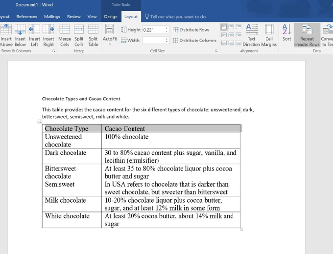
Tables
Tip: Use only simple tables, identifying the top row as table headers that repeat on every page. Provide each table a title and description.
Process
Process
Creating a Table
-
Open the Insert menu, and choose Table, and then choose Insert Table.
-
Specify the number of rows and columns needed.
Introduce the table with a title and a brief description.
Identify the Top Row as Table Headers
-
Select the first row.
-
Click the Layout tab from the Table Tools options.
-
Click the Repeat Header Row button in the Data group.
Rationale
Tables with merged cells, split cells, nested tables or blank rows and/or columns confuse the screen reading technology used by people who are blind. Telling Word that the top row of your table should be repeated at the top of every page has two advantages. Firstly, this makes tables covering more than one page easier to understand. Secondly, if the Word document is saved as a PDF document, the PDF document will recognition the first row as table headers.
Additional Resources
Creating Accessible Tables Word and PowerPoint
Special Note
The video advises creating alt text for the table. Instead, provide a title and description for the table in your Word document right above the table. This way, everyone will benefit from the title and the description.
Save Word Document as Accessible PDF
On a Windows computer, you can save your file as a tagged PDF by following these steps.
Office 2016
-
Click File > Save As and choose where you want the file to be saved.
-
In the Save As dialog box, choose PDF in the Save as type list.
-
Click Options, make sure the Document structure tags for accessibility check box is selected, and then click OK.
Office 2013
-
Click the File tab, and then click Save As.
-
Under Choose a Location, choose where you want the file to be saved.
-
Under Choose a Folder, choose a folder that you have already used or click Browse for Additional Folders to choose a different folder.
-
In the Save As dialog box, click the arrow in the Save as type list, and then click PDF.
-
Click Options.
-
Make sure that the Document structure tags for accessibility check box is selected, and then click OK.
-
Click Save.
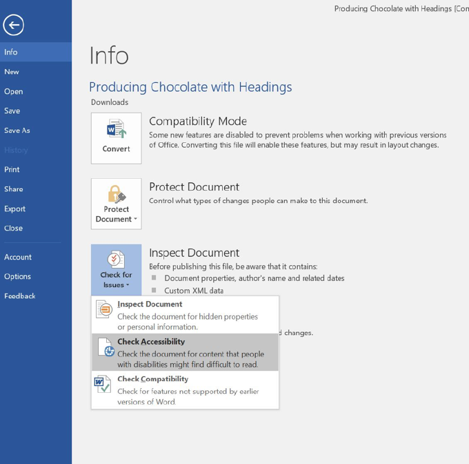
Accessibility Checker
Tip: Use Word’s Accessibility Checker to help check the accessibility of your Word documents.
Process
Process
-
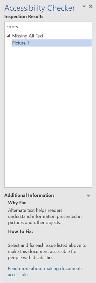
Open the File menu, and choose Check for Issues from the Info page.
-
From the Check for Issues options, choose Check Accessibility.
-
The Accessibility Checker results will appear in a panel on the right side of your screen.
-
Should any accessibility issues appear, clicking on them will locate them in your document and provide detailed information about why the problem should be fixed and how to fix it.